One Screen to Rule Them All: The Quiet Arms Race Over Your Pricing Page
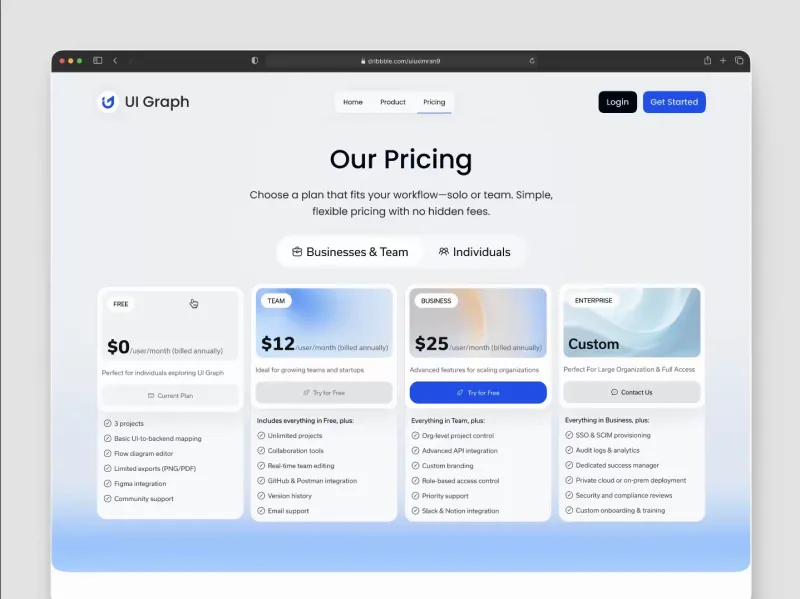
Photo: minimalist SaaS pricing page design on laptop screen clean modern, via cdn.dribbble.com
Here's an opinion I'll defend: the pricing page is doing more work than your homepage, your blog, and your founder's LinkedIn combined. And yet most founders treat it like a footer they'll get to eventually.
Walk through any YC demo day or scroll the Indie Hackers forums and you'll see it — American startups are spending more design hours on one screen than entire marketing sites used to get. They're right to. The pricing page is where hesitation lives. It's the moment a visitor stops being a reader and starts being a buyer, and every element either greases that slide or throws a wrench in it.
The Three Pricing Philosophies Fighting for Your Pixels
Flat-rate is the confidence play. One price, one plan, no calculator. Basecamp built an empire on it. The message: we trust our product, and we trust you not to abuse it. It kills decision fatigue, which in the US market is a genuine feature — your buyer has already made 200 decisions today.
Usage-based is the investor-favorite. Charge per seat, per API call, per email sent. It scales beautifully and aligns your revenue with your customers' success. But it carries a hidden tax: anxiety. Nobody wants to open their invoice like it's a gas bill. If you go this route, caps and simulators aren't optional — they're trust infrastructure.
Then there's the wild card: pay-what-you-think-it's-worth. Radiohead did it with In Rainbows; a handful of indie SaaS founders run it as a launch stunt. It generates buzz and goodwill, and it surfaces what your product is actually worth to real users. But as a permanent model? It's a novelty act. Most people default to the lowest tier, and your best customers feel vaguely guilty. Run it as an experiment, not a strategy.
The Teardown: 10 Elements That Convert US Buyers
- A default plan that's pre-selected. Americans will pick the middle option if you hand them one. Give them a good middle option.
- Annual pricing shown with the monthly math. "$29/mo billed annually ($348/yr)" — no surprises, no calculator homework.
- A real dollar figure somewhere. "Save 20%" means nothing. "$7/mo saved" converts.
- Feature labels written in outcomes, not jargon. "Never miss a follow-up" beats "workflow automation engine."
- Social proof near the buttons. A logo strip or a one-line testimonial within eyeshot of the CTA.
- An honest FAQ. Address the cancellation question directly. Yes, you can cancel anytime. Say it out loud.
- A free tier or trial that doesn't require a credit card. The card wall kills US conversions — friction at signup reads as a trap.
- Mobile-first layout. Half your traffic is pricing you from a phone in a parking lot. If your table breaks on mobile, you've lost.
- One clear CTA per plan. "Start free" beats "Learn more" and definitely beats "Contact sales" on anything under enterprise.
- A visible path to human help. A chat bubble or an email that a real person answers. It signals you'll be around.
The Three That Quietly Repel
The enterprise wall. "Contact us for pricing" on a $49 product reads as either insecurity or a trap. If your price is reasonable, show it.
The feature-comparison spreadsheet from hell. Forty rows of checkmarks isn't transparency — it's homework. Three plans, five meaningful differences. Done.
The dark pattern checkout. Pre-checked add-ons, annual-by-default with no monthly option, "free trial" that auto-converts with an email reminder buried in settings. US buyers are pattern-matched to these tricks now, and the FTC is too. Even the suspicion of one costs you the sale.
The Bottom Line
Your pricing page isn't a billing form. It's your best salesperson working the night shift, closing deals while you sleep. Give it the design hours, the copywriting attention, and the A/B tests you'd give a Super Bowl ad — because unlike the ad, this screen is where the money actually changes hands. Build it like it matters, because it's the one page every serious visitor will see.