Five Words or Fail: The Pricing Page Test Most SaaS Founders Are Flunking
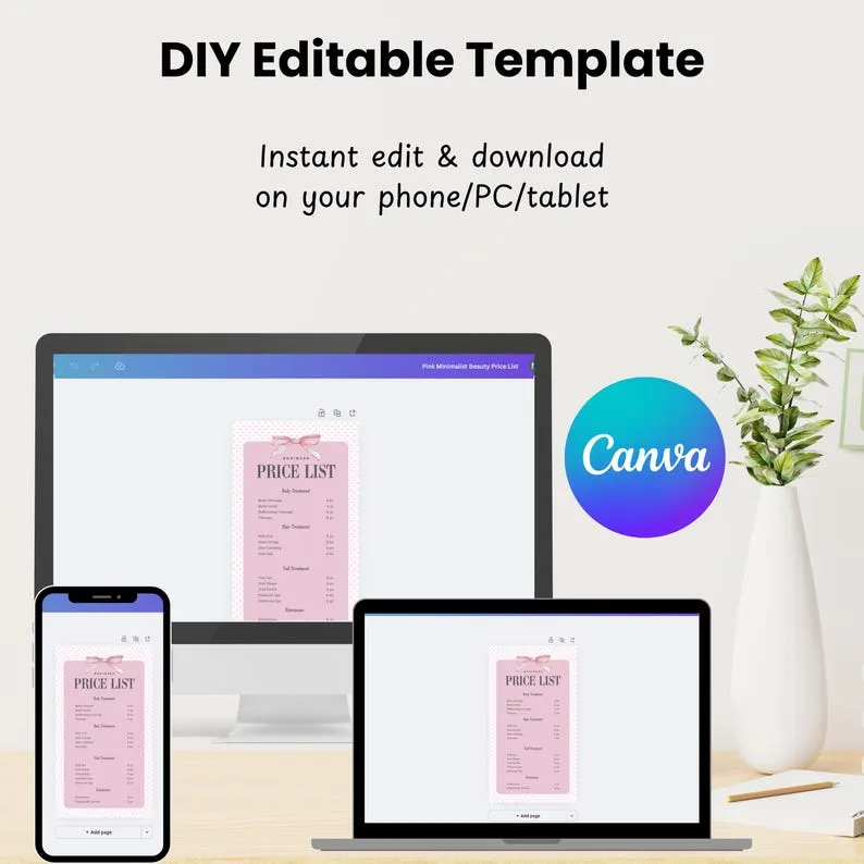
Photo: minimalist pricing page design on laptop screen, via i.etsystatic.com
Pull up your pricing page right now. Don't overthink it — just open it in a new tab and give yourself five seconds. Now answer honestly: can you tell a complete stranger what this product does, who it's for, and roughly what it costs, all before your coffee gets cold?
If you hesitated, you just failed the test your customers are silently administering every single day. And unlike you, they don't get a do-over. They get the back button.
The Five-Second Economy of Attention
American buyers — whether they're a solo consultant in Austin or a procurement manager in Chicago — have been trained by a decade of subscription software to skim. We've all signed up for Netflix, Spotify, Calendly, a dozen tools we barely remember. The muscle memory is set: scan the headline, glance at the number, decide.
That means your pricing page isn't really a pricing page. It's a landing page wearing a pricing costume. The visitor arriving there isn't asking "what features do I get?" They're asking a much simpler question: **"Is this for me, and can I afford it?"
The best US SaaS companies answer that in one scannable sentence. Not a paragraph. Not a value matrix. A sentence you could read aloud across a parking lot.
Consider the pattern across the pages that convert: a plain-language promise up top ("Everything you need to send invoices, starting at $19/mo"), a single highlighted plan, and copy that sounds like a human wrote it after two cups of coffee — not a committee after a two-hour Slack thread.
The Five-Word Exercise That Hurts to Do
Here's the exercise we recommend to every founder who'll listen, and most of them hate it.
Write your value proposition in exactly five words. Not six. Not a tagline with a hyphenated compound. Five.
"Invoices that send themselves."
"Scheduling without the back-and-forth."
"Payroll for teams of one."
Notice what happens when you try this. You can't hide behind jargon. "AI-powered workflow orchestration platform" doesn't compress to five words without collapsing into something honest. That collapse is the point. The constraint strips out the words you wrote to impress investors and keeps only the words that would convince a customer.
Once you've got your five words, put them — or something very close to them — at the top of your pricing page. Everything else is supporting cast.
Where Feature Grids Go to Die
Look, feature comparison tables exist for a reason. There's a legitimate moment in every buying decision where someone wants to know whether the $49 plan includes SSO. But that moment is the third or fourth moment, not the first.
The typical pricing page buries its one clear sentence under six columns of checkmarks, a billing toggle, an enterprise "Contact us" card, and a testimonial carousel nobody scrolls to. It's the equivalent of a restaurant menu where the dish descriptions are longer than the dish names. Exhausting.
The teardown rule of thumb: if a first-time visitor has to read more than 20 words before encountering a price, you've made them do work. Buyers don't reward work. They reward clarity.
What the Data Actually Shows
We've watched enough A/B tests in the wild — and talked to enough growth folks running them — to spot a consistent pattern: clarity beats cleverness, almost every time.
When teams swap a vague, aspirational headline ("Scale without limits!") for a concrete, plain-spoken one ("Unlimited projects for $29/mo"), the lift is rarely subtle. We've seen and heard of conversion improvements in the double digits — sometimes 15-25% on trial starts — from nothing more than rewording. No new features. No redesign. Just saying the thing.
The clever versions almost always lose because cleverness asks the reader to solve a puzzle before they can buy. Clarity asks nothing. One of those respects the visitor's time. Guess which one the market pays for.
The second pattern: a default plan matters more than plan count. Pages with one visually dominant "recommended" tier consistently outperform symmetric grids where every option looks equally weighted. Americans are famously choice-averse when the stakes feel ambiguous — give them a default and they'll take it, gratefully.
Run the Litmus Test Yourself
Before your next design sprint, try this three-step audit:
- The parking lot test. Read your pricing headline out loud to someone who doesn't know your product. Ask them to repeat it back. Whatever they mangle, rewrite.
- The five-word squeeze. Compress your promise to five words. If you can't, your positioning — not your pricing page — is the problem.
- The 20-word countdown. Count the words between the top of the page and the first price. Over 20? Cut.
None of this requires a rebrand or a growth team. It requires the willingness to sound plain in an industry addicted to sounding impressive.
The $49/mo question isn't really about the number. It's about whether a stranger, five seconds in, knows exactly what they'd be paying for — and can picture their life being easier because of it. Answer that in five words, and the feature grid becomes what it always should have been: the fine print, not the pitch.